In that regard, XC Analytics addresses all levels. Everyone can discover how they practice their activity (paragliding, hang gliding or glider) thanks to statistics and graphics adapted to their level. Recently, with the "Thermal Summary" tool (available only for paragliding and hang gliding for the moment), on which we continue to work, each pilot has a first level of "coaching" to hone his thermalling. This information will not only serve as a basis for your discussions, but also to exchange with your instructor for example. He will know how to be more specific and how to adapt the advice to better serve your advancement.

Even the language barrier can be overcome! XC Analytics is available in five languages: English, French, German, Portuguese, and Japanese, whether you are travelling abroad or just for personal use. A Spanish version will soon be available. So many ways to find the appropriate terms specific to your favorite sport, in the language that you need or that you want to practice.
Before going into the details of the instructions, let’s review the frequently asked questions you send us.
- Will an iOS / Apple version be developed?
- I only have Apple devices, is there a way to use XC Analytics anyway?

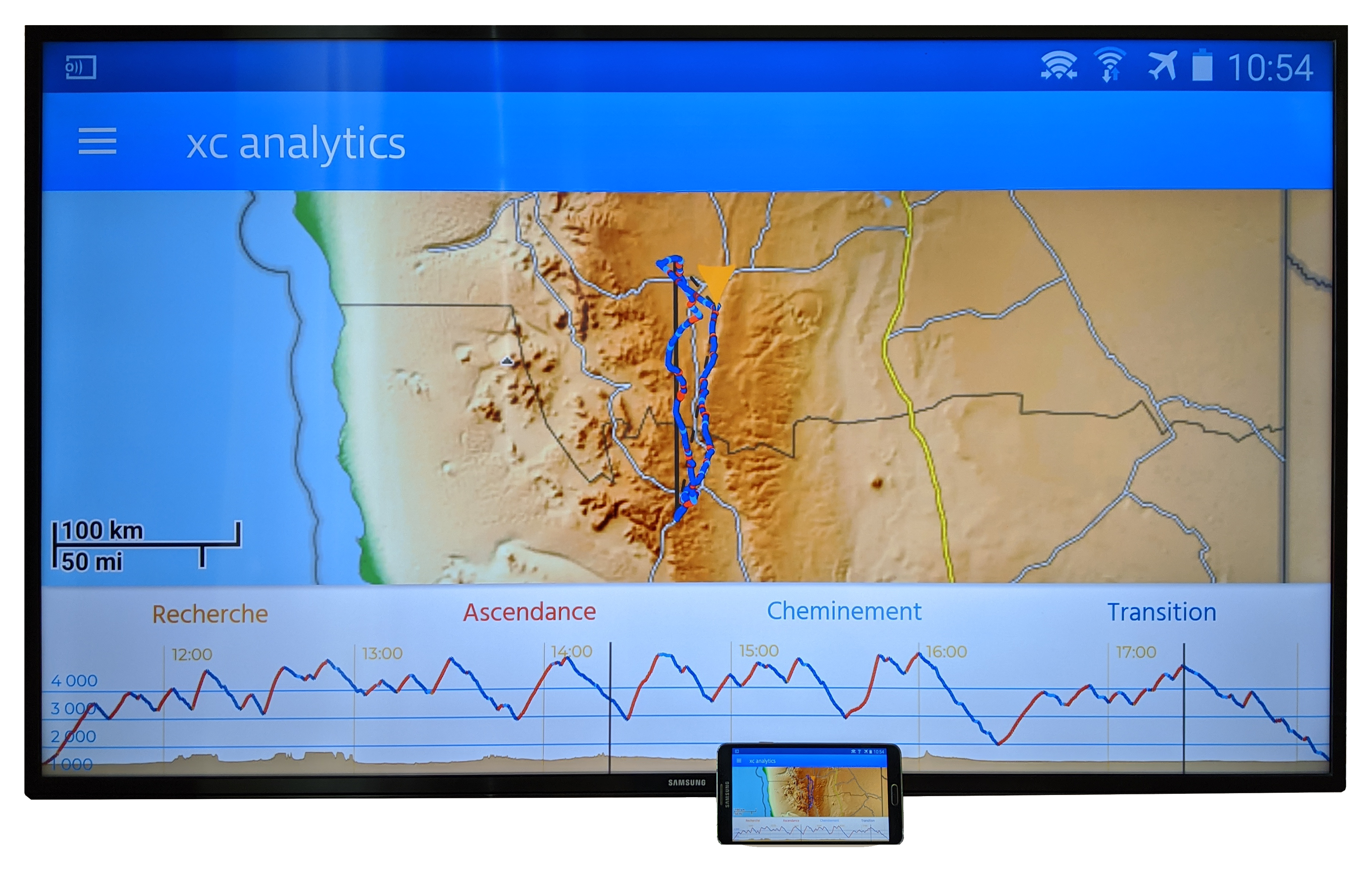
- I like to see things big, and my screen is too small. Any idea?

- XC Analytics seems interesting, but it looks complicated, I’m not sure I understand everything.
- XC Analytics is a recent application. Will you continue to develop it?
Now that you have seen that XC Analytics can adapt to all levels of practice, for pilots from many countries, and available on different devices, let’s look at its use. Rather than dwell on the intuitive handling of early experiences, we will explore some features of the application that are not necessarily obvious, even for a regular user.
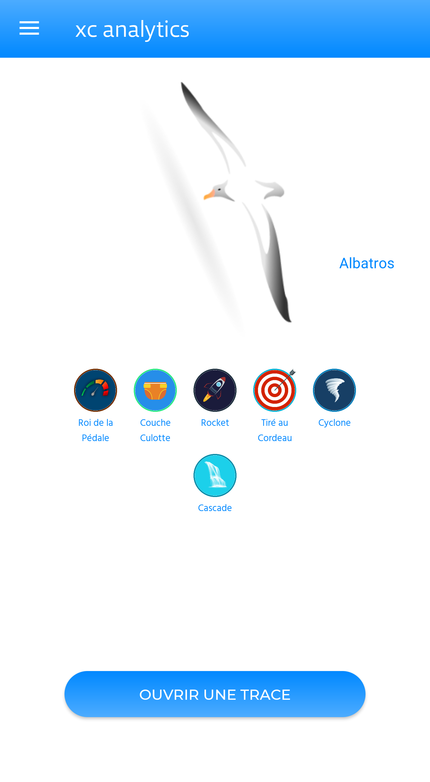
Let’s start with the badges. The idea was to focus, in an original and friendly way, on unusual results that can be obtained during our flights. First revelation: there are more than 25 currently, and we intend to add more! Some are much more difficult to obtain than others, and can highlight both incomparable successes and epic failures. Because yes, in our sport, it’s often funny to fail in our attempts, and we liked the idea of highlighting it! Also, there are more than 20 levels, which correspond to your progress, both in distance and in flight time. Thus, the initial egg transforms into various species of birds, each having its own peculiarities, and all do honor to the pilot they represent. These levels also adapt to the activity.

Then, to remember its owner, the application saves in the parameters the name that appears on the first tracklog analyzed. It is the one used to know whether a file belongs to you or not, and must faithfully correspond to the one you have entered in your device. It is always possible to edit it at any time, obviously, to correct a name change. And don’t worry, as we often say, XC Analytics does not collect any of your data. So you are not likely to be recognized on takeoffs! Note: if you practice several activities, each has its own profile of levels and badges. Just indicate it in the parameters before analyzing, for example, a sailplane tracklog after debriefing your last paragliding circuit.
Speaking of circuits, let’s go back for a moment to the issue of the closing distance. You can set it (remember it corresponds to the distance between the start point and the end point) to be aligned with the one used by your league. This can also be useful in order to efficiently compare flights between friends. On this subject, the «share» menu allows you to easily send your tracklog to the people you want, to start the analysis together.
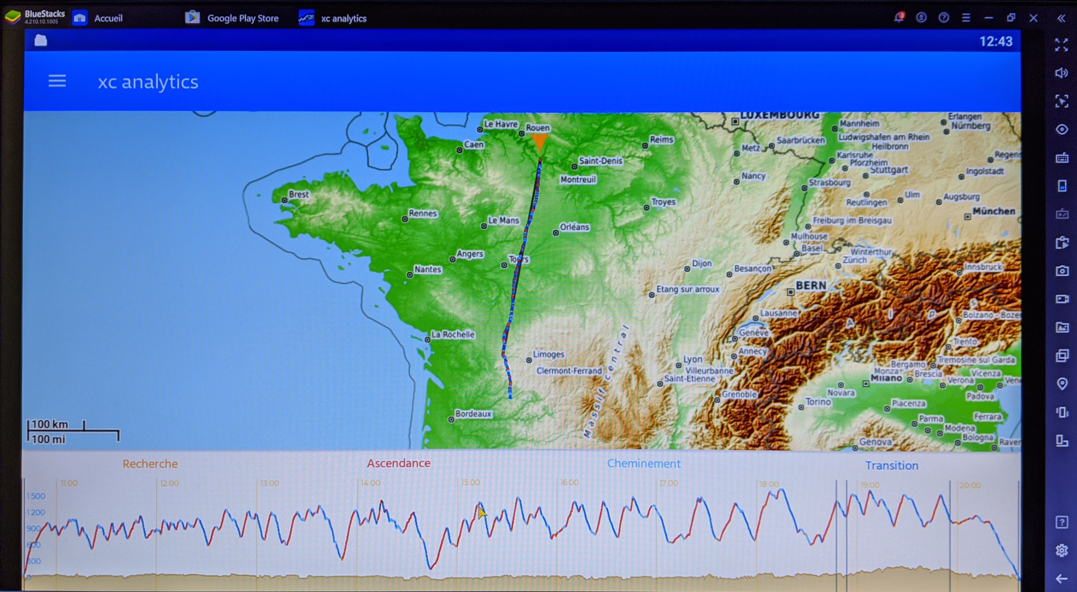
Analysis that starts with the map display. In the altitude profile area, we find the circuit turnpoints materialized by the black vertical lines. The tracklog is presented as defined by the GPS data of the igc, without reprocessing. A way to see if there are any problems on the recording. In most cases, this will result in an alert message during the analysis, which will continue, or not, depending on the level of quality of the GPS data. If the trace is of sufficient quality, then it may be re-engineered, using barometric data if available, to improve the accuracy of the results provided. You might think it’s a long process, but it’s not entirely accurate.

Most of the time can sometimes be spent downloading background data, especially if the data network gives signs of weakness. However, once loaded, this data remains in the device’s memory, which makes it possible to shorten the time for the analysis of a future flight on the same area. It is also possible to do without the data network entirely by using the "offline" function, and downloading the map of the country you are interested in beforehand.
Obviously, the more recent your device is, the faster the calculation of the results, even with a recording interval of one point per second. Indeed, it goes without saying that the size of igc files increases with the reduction of this interval. The analysis may therefore be a little longer, but the statistics produced will be even more accurate! Moreover, we advise, without hesitation and as far as possible, to adjust this interval to one point per second.
Last tip, before parting off until the next article: in comparison, to better differentiate each pilot on the graphics, the color code makes the master tracklog always appears in blue by default. With a little practice, these settings and features will become instinctive, and you will quickly be able to capture the essence of your performance in just a few minutes! And if you make discoveries during your analysis, we are always fond of it, so let us know on one of your favorite media with the hashtag #xcanalytics!


