charts
As for statistics, each chart has its own explanation. An analytics' master in the making !
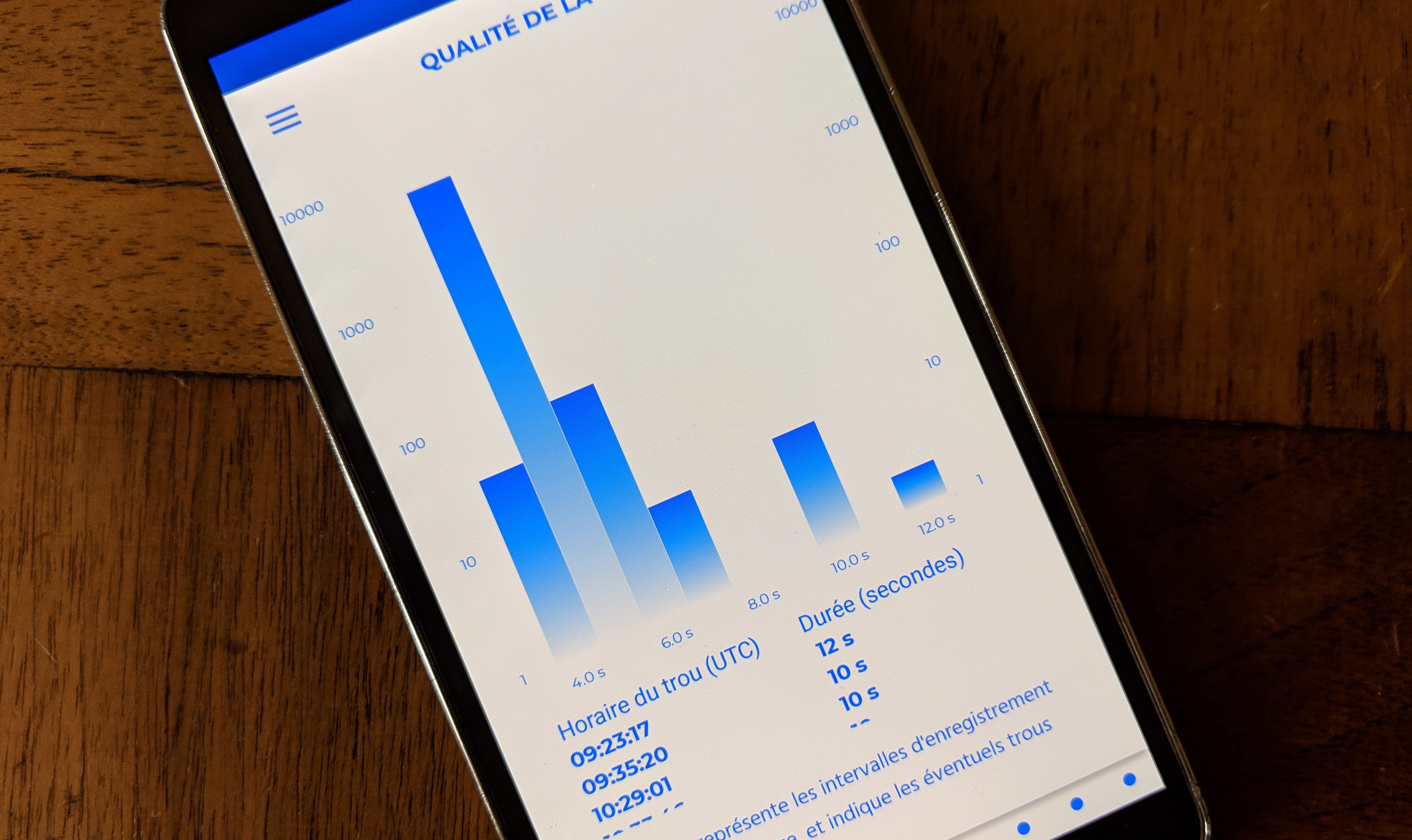

tracklog quality
This chart represents the record\'s interval of the log, and spots potential holes in it.
The better the quality of the igc file, the more reliable the analysis delivered by xc analytics will be. It is recommended to save one GPS point per second. For accuracy reasons on the results provided, igc files with less than one point per five seconds will not be analyzed. If some holes regularly appear in your track log, or if vertical and/or horizontal data seem erratic, please have your instrument checked.
linear evolution of the total distance on course
A simple soaring line, showing how you accumulated distance over time, on course. The variations of the slope deserve your attention.

variation of the total distance on course
The point here is to picture, with and without wind, the variations of the total distance on course. The 0-ordinate axis line shows a linear evolution of the odometer between the start and the end of the flight.
Above the zero line, the pilot saves time relative to the final circuit’s distance, and the opposite is true below zero. For example, time spent waiting for the start, or looking for the first thermal, will appear as lines below zero, as the distance during those sequences progress less quickly than during the rest of the course. The y-axis lets you know the exact distance gained or lost at each time.


evolution stripe
The two curves on this chart link respectively the beginning and the end of each lift phase. Two narrow curves can indicate good flying skills for example.
In the comparison mode, you get the chance to explore the “monitoring altitude” theme, especially for competition or group flights.

time spent into adjustable altitude brackets
This is the time spent in each altitude bracket relative to the total duration of the flight, in percentage. The brackets are adjustable. The default setting is one third of the highest top.
When the favorable part of the air mass has been located (using the “mean vario in each bracket” chart, for instance), it becomes easy to identify which part of the flight took place in this bracket. You can thus check if the judgement’s call about your placement, operated in-flight, was the right one or not.
average hourly speed
Those two curves represent the variations of the average speed during a sliding hour window, computed relative to the distance on course for one, and to the total distance for the other.
Reflecting on those two curves will bring out the different rhythms of the flight. An information made to highlight specific sequences, related to height, weather or strategic decisions taken during the flight.

airspeed estimate
Those curves show the evolution of your real airspeed, and your real airspeed while gliding.
To the “push” fans: here you can see and compare your ability to up the tempo on certain phases of the flight. It is however an estimate, subject to the same constraints as the “accelerated time spent assessment”.

average hourly airspeed
This line shows the evolution of the average hourly airspeed. It can be used in many different ways, but an interesting aspect would consist in identifying the changes of rhythms during the flight.

wind and speed on course
Those lines are a bit technical: they show the evolution of the head (or rear) wind component, and the evolution of the pilot's speed, on course in both cases.
Therefore, you can measure the impact of each component at each time, and the related speed. A very instructive reading, designed to influence your flying methods.


efficiency spider chart
This spider chart is based on eight parameters to assess the global efficiency of a pilot during his flight, relative to a specific benchmark based on the distance flown.
The “beginner” level relies on a benchmark composed of flights below 50k, the “senior” level, of flights between 50 and 120k, and the “expert” level, of flights above 120k. It consists in a single picture of the pilot’s skills, compared to a group of flights selected to match the characteristics of the one analyzed. This sophisticated chart may require an adaptation period. It is more comfortable to get used to it with comparisons: you can notice, for each criteria, the ones where you did better, and the ones where you did worse.

phases
This chart shows the share of each phase during the flight.
Probably one of the best illustrations to help you progress, this chart allows to grasp the first directions to take to improve: a reduction in the share of prospection, and an increase in the share of floating. Of course, it has to be mitigated with the vario data, the evolution stripe, and other charts relative to the weather.

course and direction
This chart presents the wind direction's evolution line (lhs axis), and the course in-flight (rhs axis), relative to the circuit's course (rhs axis).
So, the less those curves fluctuate, the more the pilot is aligned with the flying path and the wind direction. The y-axis shows precisely the values of those gaps.

glide ratios
Here is a picture of the glide ratios for each gliding phase, and of the mean glide ratio on the whole flight. You can try and guess your aircraft\'s performance, as well as your ability to optimize glides.
This is a reliable and relevant data for the “glide” fans!

hovering
Here we look at the time spent floating and gliding, relative to the time spent in lift and prospecting. The higher the number, the more you are moving forward. And if it is not tumbling, that is a proof of your slickness.
The idea is to limit as much as possible the volatility of this curve, but to have it stick to the highest part of the y-axis.

time spent relative to vario strength
On this chart, the time spent in lift phases (rhs bars), and in gliding phases (lhs bars), is displayed for each vario range of 0,5m/s.
turning radius
Here is the distribution (in percentage) of the turning radiuses, with a 10m bracket.
For example, if you are agile and like to play with a paraglider, your most common turning radius should be around 20m / 30m. Above 50m, maybe it is time to contemplate stronger weight shifts, unless you fly only by the sea!

ambidexterity
Here is the distribution (in percentage) of the turning radiuses, with a 10m bracket, but this time, the data is split between left and right turns. In addition, the mean vario is displayed for each frequency selected. A good way to see how to improve your ambidexterity !

mean vario each hour
Each hour, this chart reveals the corresponding mean vario.
A precious indicator to seize the evolution of weather conditions throughout the day, but also to pick out local peculiarities, or to moderate a significant increase in the share of lift’s phases on a segment of the flight that only had weak varios to offer, for instance.

left /right ratio
Right-handed or left-handed ? This chart shows if you spend more time circling on one side than the other.
Based on his flight log, a pilot will be able to determine if he has a strong bias in this regard, and then to work on balancing it. On paragliders, it can be used to detect a potential asymmetry in the rigging angles of the wing.

time spent in lift each hour
What is the share of time spent in lift each hour ? This is what this chart describes, and its evolution throughout the day.
Rough patch, thriving moment, given the environment, the cloudiness, or any other factor, the structure of the day reveals itself.

time spent in lift per 100 meters brackets
In percentage, this is the share of time spent in lift per each 100 meters bracket. A nice way to spot any weakness or strength in the airmass. This chart can also be compared to the related sounding.

mean vario in each bracket
It represents the mean of immediate varios in each bracket of one third of the maximum top reached.
This simple chart is very explicit to pilots starting cross-country flights. Each one will be able to enhance his understanding of the forecast, and refine his positioning relative to the altitude.

mean vario per 100m brackets
It represents the mean of immediate varios in brackets of 100m, based on all the altitudes visited during the flight.
A connoisseur depiction vested to experts, that are keen to dissect the air mass they met. A parallel can be established with the sounding, its temperature curve or the hodographic presentation of the wind.

gain and vario per lift
For each lift detected during the flight, discover the altitude gained in it, and the related mean vario. An excellent way to mark the triggers' locations, or to compare the climbing skills between pilots.


mean altitude for prospecting phases
For each prospecting phase, its corresponding altitude. That way, you can easily spot a critical level reached during the flight.

time spent prospecting each hour
What is the share of time spent prospecting each hour ? This is what this chart describes, and its evolution throughout the day.
Rough patch, thriving moment, given the environment, the cloudiness, or any other factor, the structure of the day reveals itself.

gain and loss of altitude in prospection
This chart shows the gain or loss of altitude in each prospection phase, revealing your skills in this kind of situation.
Only got positive bars? Tell us how you cheated!
mean altitude for floating phases
For each floating phase, its corresponding altitude. That way, you can easily spot a favourable level reached during the flight.

time spent floating each hour
What is the share of time spent floating each hour ? This is what this chart describes, and its evolution throughout the day.
Rough patch, thriving moment, given the environment, the cloudiness, or any other factor, the structure of the day reveals itself.

gain and loss of altitude while floating
This chart shows the gain or loss of altitude in each floating phase, revealing your skills in this kind of situation.
Only got positive bars? Wasn’t it the case already for prospection? If it is true, you are getting dangerously close to the divine…


time spent gliding each hour
What is the share of time spent gliding each hour ? This is what this chart describes, and its evolution throughout the day.
Rough patch, thriving moment, given the environment, the cloudiness, or any other factor, the structure of the day reveals itself.

glide ratio between two lifts
This is the required glide ratio to reach the next lift. The chart reveals, for example, landscape particularities.
average wind speed evolution
Here is a chart to map the evolution of the wind speed, based on your tracklog. A simple but eloquent way to monitor your ally (well, most of the time).
It is always interesting to compare the weather forecast to that data, to get a sense of each one’s applicability, in order to operate a cleverer selection of the spots.

average wind speed relative to altitude
This is the average wind speed computed from the areas crossed during the flight. It can be compared to the forecast picked up before taking off!
This zonal image outlines areas the wind entered in a more or less pronounced way. A wonderful mean to spot sea breeze embedding for example.

average wind direction relative to altitude
The hodograph is dedicated to picturing the evolution of the wind direction relative to the altitude. You can't get any closer to the truth!
The reading works like on a compass, as the wind’s direction curve starts from the lowest altitude in the center, to the highest one at the border.

average wind speed relative to altitude
This is the average wind speed calculated from all the altitudes reached during the flight, and its evolution.

average wind direction according to time
This hodograph presents the evolution of the average wind direction according to time. A tool to fine-tune your debriefing!
The reading works like on a compass, as the wind’s direction curve starts at the beginning of the flight in the center, to its end at the border.


")