statistics
For every statistic, you will find below detailed definitions, sometimes along examples.
-
INFORMATION
Name of the igc file
As the name suggests !
Date of flight
It is the date of the flight indicated in the HFDTE field of the igc file. An occasion to check if your instrument has the right settings.
Name of pilot
It is the name of the pilot indicated in the HFPLTPILOT field of the igc file. Another occasion to check if your instrument has the right settings.
Type of glider
It is the name of the glider indicated in the HFGTYGLIDERTYPE field of the igc file. Should you change your glider or your activity, you can populate this field accordingly.
Type of circuit
It is the optimal type of circuit computed by xc analytics, according to FAI rules. Therefore, it can be a distance with 3 turn points, an out-and-return, a flat triangle, or a FAI triangle. For gliders, if the turn points appear in the igc file, they can be used to define the circuit applied by xc analytics.
Flight type
It is the type of land that has beed flown over : flatland, mountains or ridge. To find the right one, xc analytics partly relies on the land’s topography that has been flown over.
Competition id
It is the competition id indicated in the HFCIDCOMPETITIONID field of the igc file. Once again, you can make sure you have the right settings in the instrument.
Software's name
It is the name of the software indicated in the HFFTYFRTYPE field of the igc file. If you have several instruments, this field can help to differentiate one from the other.
Take off time (UTC)
This one is displayed in UTC time or local time. The local time relies on the time zone’s settings of the instrument you installed xc analytics on. Taking off as early as possible and landing as late as possible reveals your ability to take advantage of the whole day's potential.
Depending on your location and topography, cross-country favorable conditions can start as soon as 3 to 5 hours after sunrise on 4 stars’ days. It is possible to work on mental barriers by trying to take off earlier and earlier.
Landing time (UTC)
This one is displayed in UTC time or local time. The local time relies on the time zone’s settings of the instrument you installed xc analytics on. Taking off as early as possible and landing as late as possible reveals your ability to take advantage of the whole day's potential.
Depending on your location and topography, it is sometimes possible to fly until sunset or even until the aeronautical night (30mn after sunset). Landing regularly at the same time can reveal an obstacle, or a specific bolt to spring.
Take off time (Local)
This one is displayed in UTC time or local time. The local time relies on the time zone’s settings of the instrument you installed xc analytics on. Taking off as early as possible and landing as late as possible reveals your ability to take advantage of the whole day's potential.
Depending on your location and topography, cross-country favorable conditions can start as soon as 3 to 5 hours after sunrise on 4 stars’ days. It is possible to work on mental barriers by trying to take off earlier and earlier.
Landing time (Local)
This one is displayed in UTC time or local time. The local time relies on the time zone’s settings of the instrument you installed xc analytics on. Taking off as early as possible and landing as late as possible reveals your ability to take advantage of the whole day's potential.
Depending on your location and topography, it is sometimes possible to fly until sunset or even until the aeronautical night (30mn after sunset). Landing regularly at the same time can reveal an obstacle, or a specific bolt to spring.
Cross country start time (UTC)
This one is displayed in UTC time or local time. It represents the time at which the cross-country part of the flight starts, when out of the local zone around the take-off. The local time relies on the time zone’s settings of the instrument you installed xc analytics on. Starting the cross-country section of the flight as early as possible increases the distance potential.
Comparing track logs with other pilots is also a way to put the lights on a strong or weak link during the flight. Thanks to the phase’s analysis, you can understand why some did better than others during those key moments.
Cross country start time (Local)
This one is displayed in UTC time or local time. It represents the time at which the cross-country part of the flight starts, when out of the local zone around the take-off. The local time relies on the time zone’s settings of the instrument you installed xc analytics on. Starting the cross-country section of the flight as early as possible increases the distance potential.
Comparing track logs with other pilots is also a way to put the lights on a strong or weak link during the flight. Thanks to the phase’s analysis, you can understand why some did better than others during those key moments.
On-site section duration
It is the difference between the cross country start time and the take off time. On the side of performance, you want to shorten this sequence. And thanks to this data, you can separate two different practices, and quantify the time spent on each.
This duration can be cross-checked against the evolution of wind or varios, to shed light on how the conditions start, and the effect on they have on the extraction’s time.
Total flight duration
It is the difference between landing time and take off time. Flying a long time usually means a great distance, but also implies other issues…
This time might be useful for your flight log, but also to identify a specific length of time that represents a barrier hard to cross. For instance, a pilot that frequently lands after three hours can wonder if it is linked to a peculiar situation or state of mind at that time.
Total flight duration after on-site section
It is the difference between landing time and cross country start time.
In the flatlands mostly, this number can help to determine how advanced you are in your progression, especially if compared with the “on-site section duration” for example. Over time, the goal is to reduce the “on-site section duration” relative to this “total flight duration after on-site section”.
-
DISTANCE
Longest distance on course
This number represents the longest distance on course based on FAI criteria, from the beginning of the cross country section. Without a cross country start mark, it is the longest distance on course computed on the whole flight.
Even if it’s the easiest gauge to grasp, it should be linked to every other stress met during the flight: weather issue, airspace, circuit’s type, topography, etc. It is sometimes harder to complete 50k than 200k, and xc analytics helps understanding why.
Total distance flown
This measure is only based on the track to determine the total distance flown. Therefore it shows the total distance covered relative to the ground.
This distance shows many features of the flight, and some of them are disclosed by other statistics.
Axis ratio
It represents the ratio between the longest distance on course and the off-axis total distance. In the off-axis total distance, the lift phases only count for their straight distance equivalent. Thus the total distance covered during a lift phase, for example, does not include the distance covered for each circle in a thermal.
The more a pilot moves away from the lines defining his circuit, the more the ratio drops. Theoretically, he is losing time. If this ratio tends to remain low, a way to improve would consist in preparing the intended flying path better, and to get a closer look at the weather forecast and its evolution.
Off-wind total distance
This distance is calculated by removing the wind effect. Therefore it is the total distance covered minus the average wind calculated during the flight.
Isolating the wind component this way makes it easier to encompass its impact on the distance flown. It must not be mistaken with the “off-wind distance on course”, which, by construction, increases the wind’s impact relative to the distance.
Off-wind distance on course
This on course distance is calculated by removing the wind effect. It is the longest distance on course minus the average wind calculated during the flight.
A statistic that can be compared with the “off-wind total distance”, to grasp the wind’s implications on the flight better, and when appropriate, the relevance of the chosen flying path.
Straight distance / 1, 2 or 3 turnpoints / out and return / FAI triangle / flat triangle / via igc turnpoints
It is the most favorable distance calculated for each mentioned type, knowing that circuits are considered closed based on the rule of the 400 meters radius FAI cylinder.
If the igc contains turnpoints and the flight validates each one of them, based on the FAI cylinder (radius 400 meters) or on the FAI sector, so is the distance then calculated, which will serve as a basis for the flight's statistics.
-
ALTITUDE
Maximum altitude
A number that shows the maximum altitude reached during the flight. A lack of oxygen perhaps ?
As symbolic as it may be, this number can show a non-typical sequence of the flight, that sometimes deserves more attention: higher cloud base, convergence, humidity disorder, etc.
Cumulative altitude gain
It is the sum of all the altitude gains achieved during lift phases. A low figure can indicate a talent for floating, which means not losing altitude while moving.
Indeed, while looking at historical flights, relative to each distance flown, this gain can act as a simple benchmark of one’s ability to minimize the “potential energy” required, be it for weather reasons or gliding proficiency. It is even more eloquent when compared with other pilot’s flights on a same day.
Height of the lowest save
Here is the lowest height reached on your worst low save. The lower it is, the more it shows you can bounce back from difficult situations, but it also reveals a possible mistake.
It is also the counterpart of the “maximum altitude”, meaning that the data can reveal a specific phenomenon, related to the weather, a pilot’s choice, or his mental condition.
Average flight altitude
The average flight altitude is linked to the ground elevation, and your skills.
The best pilots have a tendency to fly in the best slot of the air mass. Most of the time, it is located either not far from cloud base, or close the mountain tops and ridges. Compare those three values to improve your vertical positioning in the air.
Number of low saves
It is the number of sections taking place below 300m above the ground.
The implications are two-fold, based on topography: performance and safety. In the flatlands, reducing the number of low saves actually saves time, thus performance. In the mountains, it is ambivalent, because even if flying close to the terrain can increase the share of floating phases, it is also the height below which you are exposed to higher risks in case of an incident. Thanks to this indicator, you can learn how to place the risk’s cursor to your desired level!
Evolution stripe thickness
This statistic is calculated by subtracting the average altitudes of lows from the average altitude of tops.
A narrow evolution stripe means a strong capacity to bounce up (to the detriment of speed), or to float (ideal). This is important in competitions, too. It can reveal a natural propensity to hold on to “control” positions above the other competitors. Make up your mind by comparing tracks!
Time spent below 300m AGL
This is a key indicator, if you consider that flying close to the ground is not efficient (in the flatland areas especially).
It is also, with the “number of low saves”, a fine measurement of the level of risk applied to a flight. To be aware of this, thanks to this data, allows you to make it match to the level you had in mind pre-flight. It can also be a non-biased anchoring point to remember while flying stressful phases, that can lead to subjectivity.
-
SPEED
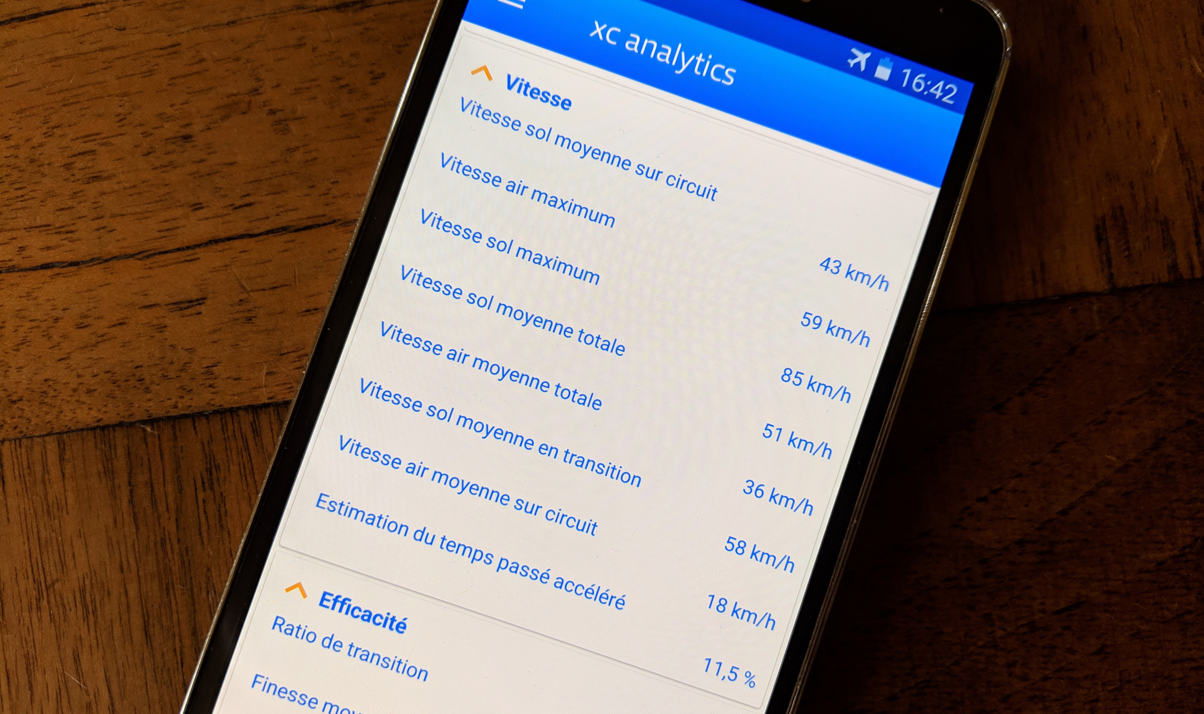
Average ground speed on course
This number represents the average ground speed, computed on the basis of the aforementioned circuit. That speed generally matches the one you get on the websites where you claim your flights.
Along with the flight duration, they are the two pillars of performance. But they are none the less “final” indicators: the average ground speed on course only describes a reality based on all the parameters of a flight, described in those statistics and later in the charts.
Maximum airspeed
A comparative basis for our aircrafts?
This value can be used to compare our aircraft with each other, but also, based on several track logs, to detect adjustment or wing loading differences (other things considered equal).
Maximum ground speed
The wind is your best friend. Watch out for speed radars!
Competitors will enjoy comparing this data, usually met near the end of speed section.
Total average airspeed
It is the average airspeed on the whole flight. An excellent picture of your speed during the flight!
This number makes it possible to notice if pushing the speed bar or using the brakes had a significant impact on your average pace. An excellent standard to cross-check it against other pilots in a group flight.
Total average ground speed
This is the average ground speed on the whole flight, calculated without the on-site section.
Average ground speed in glide
Calculate the average ground speed after a merge of the gliding and floating phases, that is the number you get.
Mostly during those phases can you increase your average flight speed. Some may use the McCready to target the right pace, others may refer to the Cochrane’s model. They would better fit your level though, and especially the way it affects the quality of your floating phases. A real avenue of progression!
Average airspeed on course
It is the average airspeed, this time calculated on the basis of the aforementioned circuit.
Accelerated time spent assessment
This statistic theoretically requires a glide polar. The chronometer runs as soon as the airspeed exceeds the speed of maximum glide ratio. This time is then divided by the total flight duration.
What this data lacks in precision, xc analytics will make up for it in future updates, by embedding the polar curve of your aircraft. It is also very sensitive to the track log quality (cf. “Charts”). A precise GPS and a narrow recording interval (1s) will improve its reliability.
-
EFFICIENCY
Gliding time ratio de transition
This ratio reveals the proportion of time spend gliding or floating during the whole flight. The higher the number, the less time is spent circling, the more efficient you are!
This data can be compared to the best flights done in flatlands or mountains on your aircraft’s type, to get a relevant benchmark. For example, paragliding in the flatlands, a ratio above 60% represents a very good level. The longer the distance, the more difficult it is to keep this ratio high however.
Total glide ratio on-axis
The glide ratio presented here comes from the total distance on course over the sum of altitude's gains. The higher the ratio, the more talented the pilot.
Average glide ratio during gliding time
From gliding and floating phases, this number relates to the sum of distances flown during each those phases, over the sum of altitude\'s differences observed once again on those phases.
Transverse effect
This is the difference between the route followed on course and the wind's direction.
It is always a good idea to keep this effect low, which means essentially to go with the wind. In case of a declared task, it can reveal the benefit reaped by a pilot, thanks to a strategy more closely aligned to weather parameters.
Average output of the circuit's axes
It is the pourcentage of distance flown on course relative to a theoretical distance that would have been achieved in keeping with the wind's direction. It encompasses the gliding time ratio, the transverse effect, the average wind speed and the average airspeed in glide.
Pretty technical, the aim is to gauge a circuit’s pertinence, or, on the contrary, its difficulty (in competitions for instance).
Distance lost relative to the circuit
In order to understand the previous statistic (average output of the circuit's axes) better, we created this one, representing the distance lost because of the non alignment of the circuit with the wind. Said differently, it would be the theoretical additional distance covered, had the circuit been perfectly aligned with the wind direction.
-
LIFT
Number of lifts
Obviously, the number of lifts tapped during the flight.
A low number relative to the distance flown can indicate either long gliding phases and a thick “evolution stripe” (cf. “Charts”), or long floating phases and a narrower “evolution stripe”, which is actually a good progress target.
Number of circles in lifts
Obviously, the number of lifts tapped during the flight.
Number of circles in lifts per minute
Take the statistic above (the number of circles in lifts), divide it by the total flight duration, and you get the average portion of circle that you completed each minute. Another way to see how spiraling affects your flight.
Mean vario
It is equal to the mean of immediate varios during lift phases. An interesting indicator when compared with your fellow pilots!
If they get a higher mean vario indeed, maybe they are better at finding stronger thermals, or maybe they just climb in the core. Two working areas that must not be overlooked!
Longest lift
How long did you spend in a single lift at the maximum ? Or your greatest effort, in a way.
Practicing to stay as long as you can in a lift is a brilliant way to get some skills, especially when the varios are weak. No one can avoid a bad patch, and if you are prepared, confident in your abilities to face it, there is no denying that it is a plus.
Maximum altitude's gain
How much height did you get at best from only one lift ? Here is your answer. A notice to the champions of ascents!
Mean altitude gain per lift
This one is fairly simple to obtain: divide the cumulative altitude gain by the number of lifts, and here you go ! When you are working on your thermalling skills at your usual spot for example, it can be very useful when compared with the top of usable lift.
Circle average duration
It is the average time spent to complete one circle in the lift. Comparing with others, you will quickly discover if you tend to turn tight or loose.
This data also reveals your way of dealing with lifts. It can be a bit slower for beginners than it is for experts pilots. They usually favor a natural angle that minimizes the drag and reduces controls inputs, in order to avoid damaging the gliding properties of the aircraft.
Turbulence and skills
This statistic is mainly an estimate, based on the standard deviation relative to the mean vario, showing either the ability of the pilot to average the lift, or the impact of turbulence on updrafts. If it is inferior to the mean vario, it is usually a good sign.
Extrapolating the matter to safety, we could consider weather conditions showing a high number here as adverse, or preferably avoided.
-
PROSPECTING
Time lost per lift
Thanks to the sum of prospecting phases' duration, and the number of lifts, this number the time lost to find or optimize an updraft.
This is an obvious avenue of progression, that can be decomposed as three situations to work on: finding a lift quickly, centering and climbing continuously, and possibly getting back in without delay if it was lost.
Prospecting share
This is the ratio of the time lost prospecting to the time spent both prospecting or in a lift. A good indicator to gauge your thermal skills.
You want to make this number decrease as much as possible. Notice how it evolves over time, to see if you are making progress in this regard.
Mean vario during prospection
This is the mean vario calculated only during prospection phases. It proves your efficiency while chasing lifts... Or not !
Of course, it is better to prospect while slightly climbing, than the opposite. A commonplace remark, yet the best pilots are consistently in the first situation. Thus it is a matter of honing your “feeling”.
Longest prospection
With this indicator, detect a difficult moment of the flight or identify the moment you lost the most time at a glance.
Therefore, you can find the true origin of such a phase, whether it is based on psychologic, weather or strategic considerations. Everyone can make mistakes!
Potential distance lost prospecting
This one is obtained by multiplying the prospecting phases' duration by the average speed on course. Therefore you know exactly the potential distance lost while flying in this relatively inefficient phase.
Potential speed without prospecting
This number is related to the previous statistic (potential distance lost prospecting), regarding speed this time. Add the potential distance lost prospecting to the longest distance on course, calculate the corresponding speed, and this is the result you will get. It can be useful to grasp the impact of prospecting on your average speed.
-
FLOATING
Time spent closer than 50m from the ground
The security gauge par excellence, the time spent at an orthogonal distance inferior to 50m to the relief makes you aware of the inherent risk.
If “time spent below 300m AGL” indicates a risky situation, “time spent closer than 50m from the ground” reveals a danger zone. If anything should happen, your reaction time has to be instinctive and immediate to escape the punishment. In this case, a welcoming vegetation is your best friend!
Mean nearness of the ground
The mean orthogonal distance to the ground can stand as a basis for several analyses, by coupling it with the mean altitude of floating phases chart for instance.
Floating share
The ratio of the time spent floating to the time spent both floating or gliding is a good way to gauge your feeling of the air mass.
Mean vario while floating
This is the mean vario calculated only during floating phases. A good indicator of your ability to glide without losing height.
Longest floating period
With this statistic, identifying when you were on a roll is easily done.
Finding the causes leading to this episode will allow, as for the “longest prospection”, to identify avenues of progression for the flights to come.
-
GLIDING
Mean vario while gliding
This is the mean vario calculated only during gliding phases.
Gliding is a phase that entails a loss of altitude. To progress, the idea is to decrease its share, or to improve the corresponding vario, and this is what factoring this number will allow.
Floating share
The ratio of the time spent floating to the time spent both floating or gliding is a good way to gauge your feeling of the airmass.
Still from the perspective of optimizing the “straight line” flying part, increasing the floating share relative to the gliding share is an essential recipe. The more the floating share increases, the more the mileage indicator increases, without any potential energy loss, which is the equivalent of your altitude’s reservoir. In other words, floating might deteriorate flying straight, but covering more distance losing less altitude is often a performance factor. So it is an equilibrium to look for, linked to the possibility to glide fast, and climb hard.
Mean glide ratio while gliding
This is the mean glide ratio for each gliding phase. Comparing with others, you can notice your aircraft's performance, for example.
This data also informs about the impact of the wind on the glide ratio, or even reveals a certain ability to dodge strong descent’s areas.
Longest glide
End of day's glide enthusiast ? Let's find out the longest time spent gliding of your flight.
-
METEO
Average wind speed
With the average wind speed met during the flight, you can compare, at last, the forecast to field reality.
It is possible to see its impact on the glide ratio, given the chosen flying path. More precise representations of this parameter are available in the “Charts” section.
Wind mean direction
This is the wind mean direction you got to deal with during the flight. It can be really useful in flatland areas to conduct a deep analysis. In the mountains on the other hand, it can be scrambled by the mountain breeze.
Average distance between lifts
This data shows the average distance between two lifts. On decent days, this number usually falls below 5km.
The indicator loses its relevance in mountain areas, where ridge soaring is possible.
Mean glide ratio required between lifts
Calculated via the off-wind total distance, this ratio is equal to the mean glide ratio between lifts. It is one of the parameters that define a day's quality.

")