Alain’s introduction
Do you have to wedge your thumb in the carabiner when you circle a thermal? For some it is obvious, for others, it is heresy so much the grass seems greener elsewhere. What is clear, when looking at the tracklogs, is that each pilot favours a certain pace while climbing and goes back to it quickly if he moves astray. During a cross-country, the GPS records the pilot’s time and geographical position roughly once every second. From there, the pilot’s course can be rendered, both in distance and altitude. In the mountains, it is first of all the terrain that structures the air mass. In the flatlands, the air mass where the pilot is evolving moves with the wind. The tracklog his GPS is recording is a way to get to know it better.
First, we will try to recalculate the tracklog no longer in geographical coordinates but in coordinates linked to the air mass. First, we find that the tracklog makes it possible to measure the horizontal velocity of the air mass through the lifts. In fact, very often, the pilot describes almost perfect circles while climbing. All you have to do is find a wind correction that makes thos circles overlay perfectly to get the speed and direction of the local wind. From these measurements, an average wind speed is calculated, based on time over the entire flight. It is then necessary to assume that the average wind is the same during the glides. Adjusted to the wind, the tracklog gives another picture of the pilot’s course. In particular, the circles in the lifts are superimposed and the tracklog in the thermals is seen as vertically aligned.
Each of the measured horizontal velocities differs significantly from the mean. Their dispersion gives an idea of the horizontal turbulence. The measurements extend, with respect to altitude, from the lows of the flight, usually at 500 meters AGL, to the maximum altitude of the flight, between 1000 and 1500 meters AGL. It is therefore possible, by selecting altitude ranges, to get an idea of the variations in the average wind. Also thanks to the vario indications, one can have access to the activity of the lifting areas and to the vertical turbulences. The air mass thus appears to be paved with lifts whose distribution can be assessed, and to a certain extent, so does its range. If, in on given day, several pilots have made distance flights from the same take-off, we will obtain a better vision of the air mass that day.
Knowing, thanks to the vario and the sink rate of the glider, the climbing of the air, assuming (which is a rather strong approximation) that it is constant from the ground, one can access the trigger area of the bubble and its characteristics (vegetation, slope, orientation). With the distribution of the lifts, their width and climbing rate, it is possible to build an activity index of the air mass. If we have many tracklogs, we can compare the various indices, while being aware that the disparities observed can come from both the skills of the pilots and the air mass itself.
The "vertically processed" tracklog is used to calculate a progression speed rate in the air mass, independent of the wind and the distance travelled there, both of which reveal the pilot’s ability to take advantage of the weather. Of course, the examination of the tracklogs does not allow a clear distinction between what is the pilot’s decision and what is the hazard of the boundary layer. The results obtained are therefore indicative only.
They must be compared with the day’s forecast and the pilots' feelings. Additional observations along the circuit would be very useful:
- From the ground: soil temperature and humidity, rainfall the day before, photos of the sky, satellite images, solar radiation, and local soundings.
- During the flight: simultaneous recording of the GPS position, temperature and humidity, cloudbase, timestamp when reaching condensation’s level, and declaration of a cloud street.
Each chapter of this presentation focuses on a particular feature of the boundary layer and the methodology used to obtain it. It is illustrated by the analysis of one or more tracklogs of long and recent flights, sometimes extraordinary. The small number of flights analysed, and in an home-made way, probably does not make it possible to draw formal conclusions on the reliability of this method. But, hopefully, thanks to modern data analysis techniques, it will be possible to gather and compare the information obtained from the weather forecasts and those obtained from the paragliding pilots' flights on a daily basis.
Alain’s post
The pilot who looks at his track on the FFVL website sees it a succession of straight lines for glides and cicloids in lifts, or even simple broken lines if the wind is strong. In thermals, the pilot makes circles in the air mass and the wind causes these circles to deform. A typical image of such a sequence is shown below.
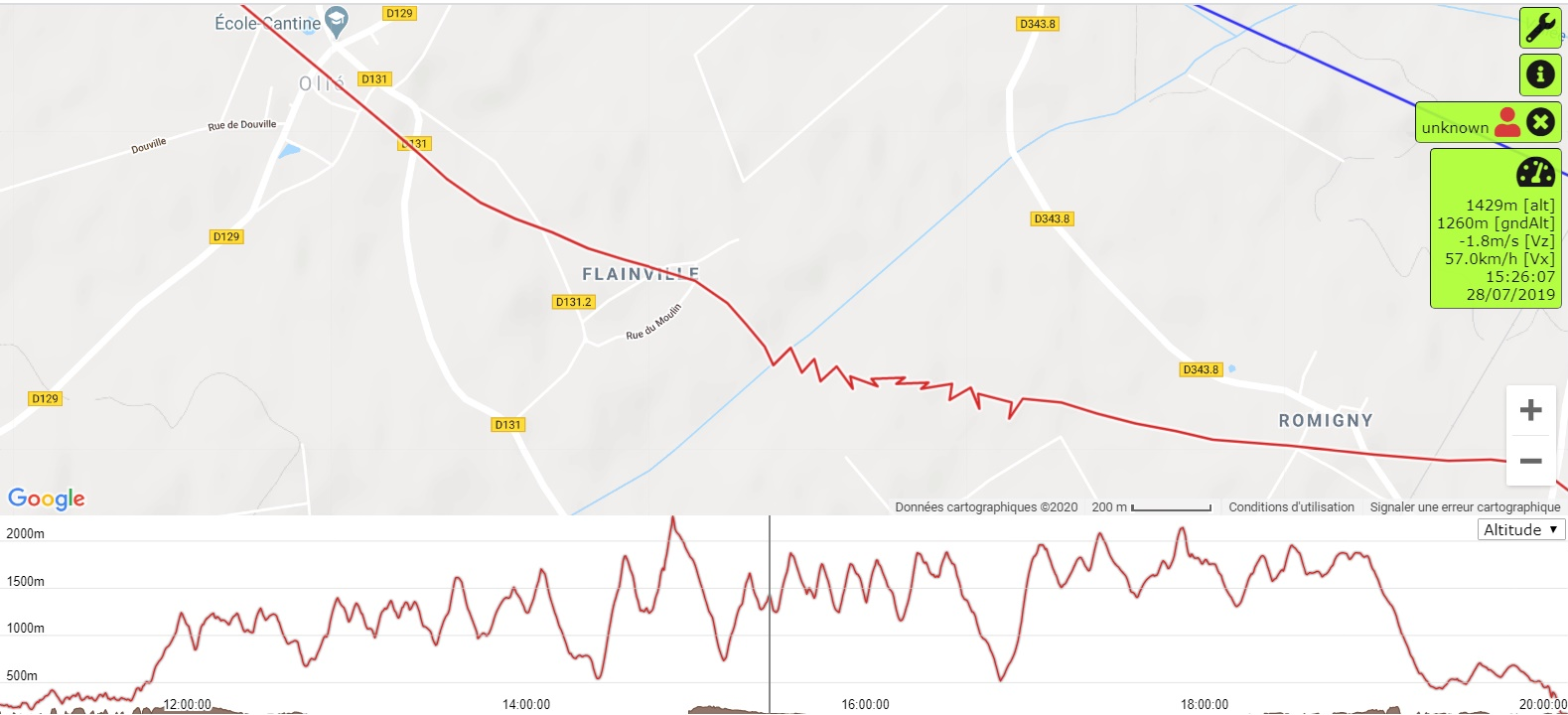
The IGC file recorded by the GPS provides the chart of this flight’s sequence from the start of the glide. After entering the thermal in a straight line for nearly 500 meters, the pilot shifts his trajectory to the south and then successively circles 10 times and goes on eastward in a straight line, climbing sharply, to finally turn to the southeast to exit the thermal.
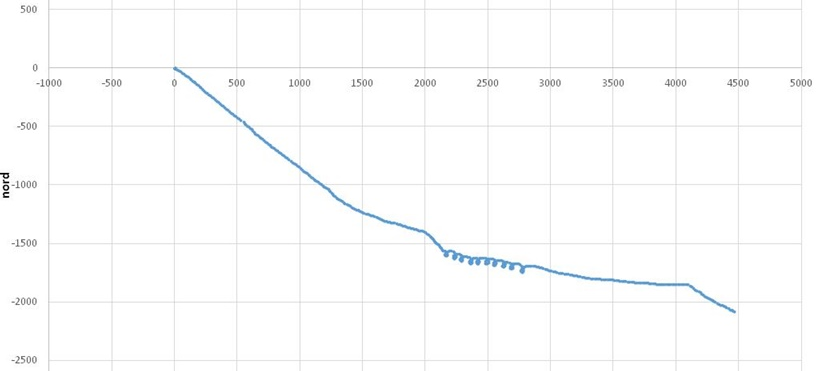
The deformation in the circles is due to the wind. Adjusting the tracklog with the day’s wind, we must be able to find the pilot’s path in the air mass. The wind for that day was 15 km/h westerly. Applying this correction, the track is as follows:
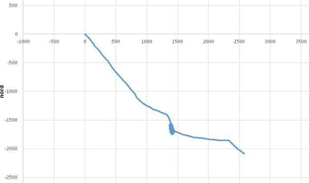
The circles are tighter, but we feel that we can do better. Groping along, we arrive at the following figure:
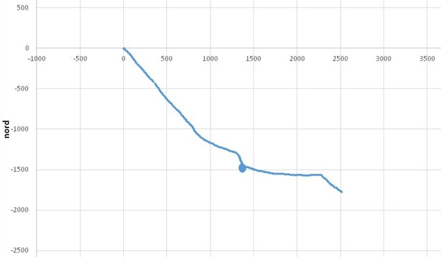
The circles are almost perfectly superimposed. The distance covered in the sequence, which was about 5 kilometers, is now only about 3 kilometers. The pilot travelled 3 kilometers on his own, and the wind helped him for 2 kilometers. The wind that allowed this near-optimum adjustment is at 279°, for 15.7 km/h. It is a bit different from the wind forecast. We can now zoom in on the circles.
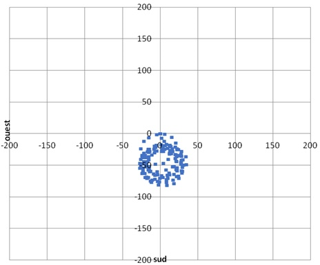
Some loops are not properly centered. To see more clearly, one can observe the circles obliquely.
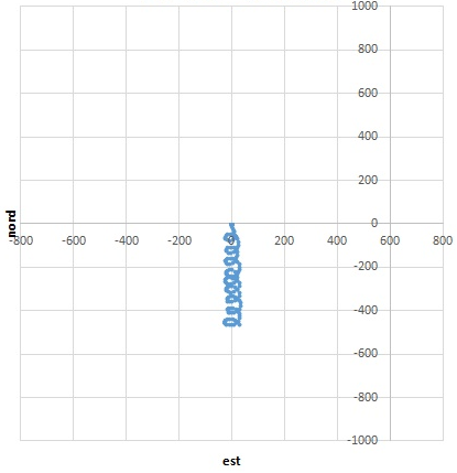
On this view, we see that there are in fact three zones. A first one with three circles, a second one with four, and the last, only two. To explain these three areas, there are two hypothesis: either the pilot deliberately altered his trajectory, or the local wind changed. Since the circles look very similar, the first hypothesis is unlikely. On the other hand, the turbulence, still present, could explain these variations. Here, it is necessary to decide how to segment all those circles. If you segment too much, you can lose some relevance. In the end, two segments have been chosen: the first three circles, and the last six. The best alignment of the last six leads to the following figure:
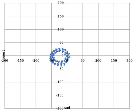
whose characteristics are as follows:
- Number: 6
- Mean diameter: 52.8 meters
- Pilot's speed: 10.3 meters per second
- Wind direction: 279°
- Wind speed: 15.7 km/h
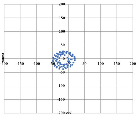
And if you take 280° and 15.7 km/h, the image is also less balanced.
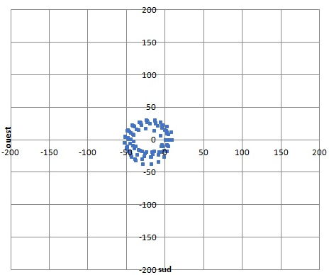
This method therefore allows to measure the local wind with a 1° margin in direction, and better than 1km/h in speed. It should be noted that the local wind for the first three circles was 14.2 km/h in speed and 262° in direction. We can also note the time per turn here is at 16 seconds, which is very tight and characteristic of Martin Morlet’s style. The mean vario of this segment is equal to +2.3 m/s. We can deduce the climb rate of the air if we know the sink rate of the glider. Even if an Enzo 3 has a sink rate in the vicinity of -0.9 m/s in a straight line, its sink in a 16 seconds circle should be around 1.4 m/s, so it could be deduced that the climb rate of the air is about +3.7 m/s. Unfortunately, there are no tables available for the sink rate of gliders while circling, and few pilots have conducted tests in calm air to get a clear idea.
Thanks to the « vertical processing » of tracklogs, a 3D local sounding of the air mass can be achieved. With the entire tracklog, we can accurately calculate a mean wind and the variations around the mean wind. The distance traveled and the speed in the boundary layer can be estimated, indicating the pilot’s true ability to take advantage of the day’s buoyancy.


